Duncan Fernandez is an architect based in Cusco who works across residential buildings, urban projects, interior design, and graphic branding. His portfolio site needed to hold all of that without collapsing into chaos. Here's a feature-by-feature look at how it was built.
Category filter system
Projects are tagged by discipline. The filter bar lets any visitor jump to what's relevant to them without scrolling through unrelated work. Architecture, interior design, and graphic design are different enough fields that a developer and a restaurant owner shouldn't have to see the same grid.


Dynamic layout randomization on every visit
The project grid doesn't look the same twice. On each page load, card sizes and column spans are reshuffled. Some projects appear large, others small — the hierarchy shifts. This keeps the site feeling alive for returning visitors, and it subtly communicates that there's always more to discover.
Timeline view for chronological browsing
Beyond the grid, a timeline view organizes everything by year and month. This is for anyone trying to understand an architect's trajectory — what periods were most prolific, how the work has evolved, where the practice is heading. It adds a narrative layer that a static gallery can't provide.
Intuitive zoom on project images
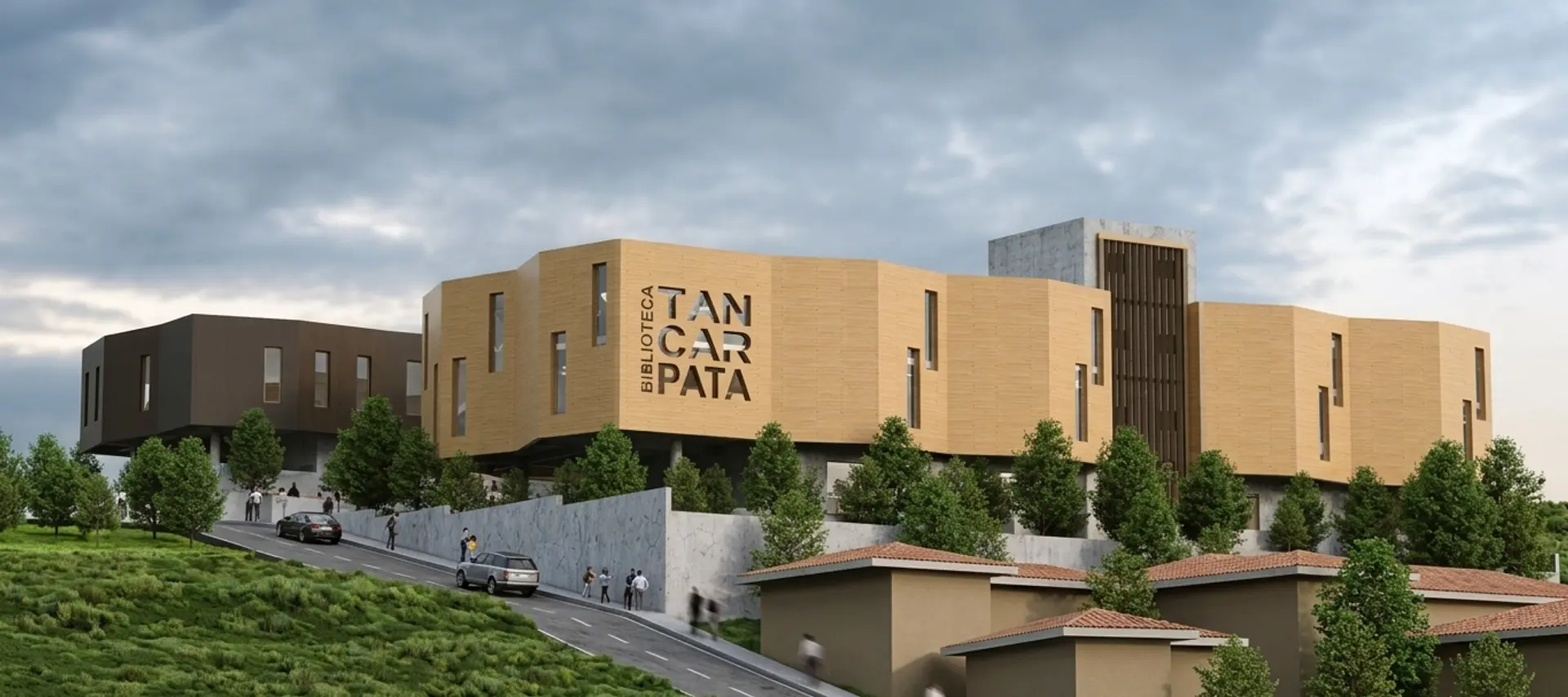
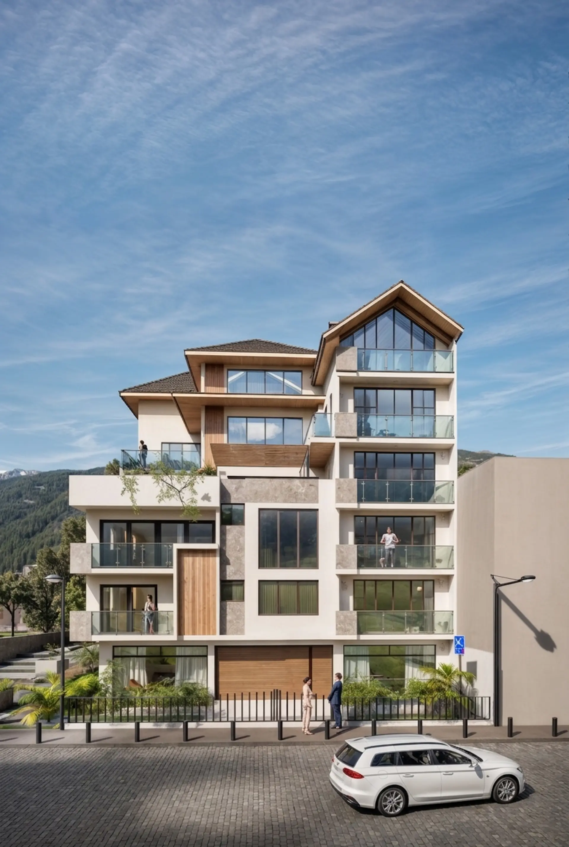
Clicking any image opens a full-screen view with a smooth transition. Renders deserve to be seen at full resolution — a thumbnail doesn't communicate scale, material, or spatial quality the way a full-screen image does. On mobile, pinch-to-zoom works natively.
Bilingual support (Spanish and English)
The site switches between Spanish and English without a page reload. Language preference is stored in the browser. For an architect in Cusco who also presents work to international clients, communicating clearly in both directions isn't optional — it's the difference between a client understanding the project or not.
Minimalist aesthetic — Apple-inspired
The visual language is built on restraint. White space works harder than decoration. The project info stays hidden until you interact — title and category appear on hover, keeping the grid clean and letting the images carry the content. Nothing competes with the work itself.
Hover to reveal project info
Fully responsive for desktop and mobile
The layout doesn't just "work" on mobile — it's designed for it. The grid reflows, type scales properly, touch is native. Around 60% of portfolio visitors arrive on a phone. A site that breaks on mobile loses clients before they've seen a single project.
Personal bio communicating design philosophy
The bio page isn't a CV. It's a statement of how Duncan approaches his work — what he cares about, what constraints shape his decisions, what he finds worth solving. This is often the page that converts a curious visitor into a potential client. It makes the practice human.

Under the hood
Custom coded — no templates or page builders
The entire site is written by hand: HTML, CSS, JavaScript. No WordPress, Webflow, or Squarespace. This means zero bloat — no unused CSS, no background scripts, no licensing fees. The code does exactly what the design requires, not what a template allows.
WebP optimized images for fast load times
Every image is converted to WebP and compressed without visible quality loss. WebP files are typically 25–35% smaller than equivalent JPGs. On a portfolio where images are everything, this difference is felt immediately — especially on mobile connections.
Hosted on Cloudflare
Cloudflare's global CDN serves the site from the edge location closest to each visitor. Pages load in under 500ms from virtually anywhere. It's free at the scale a portfolio needs, and it includes DDoS protection and automatic HTTPS.
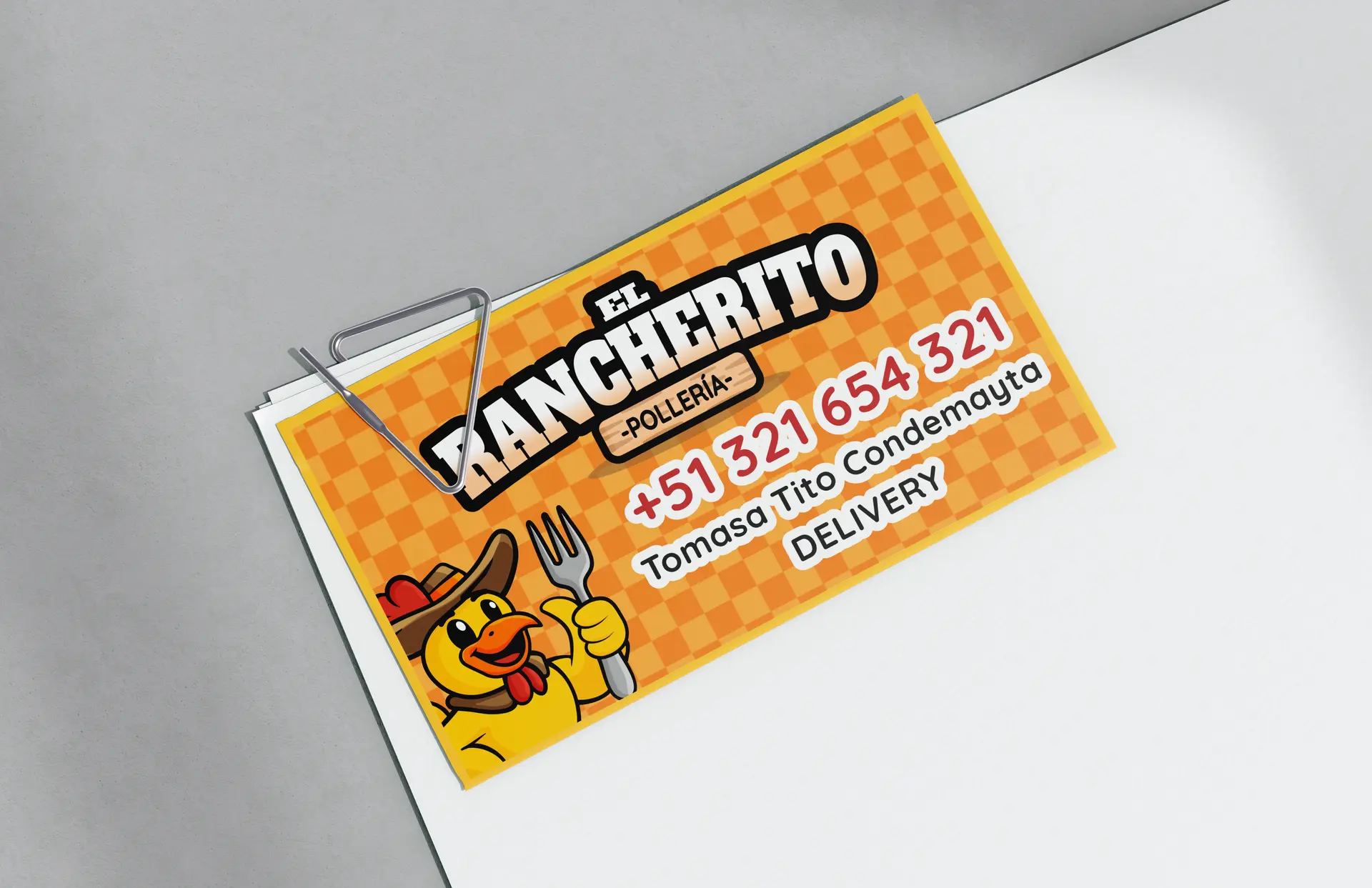
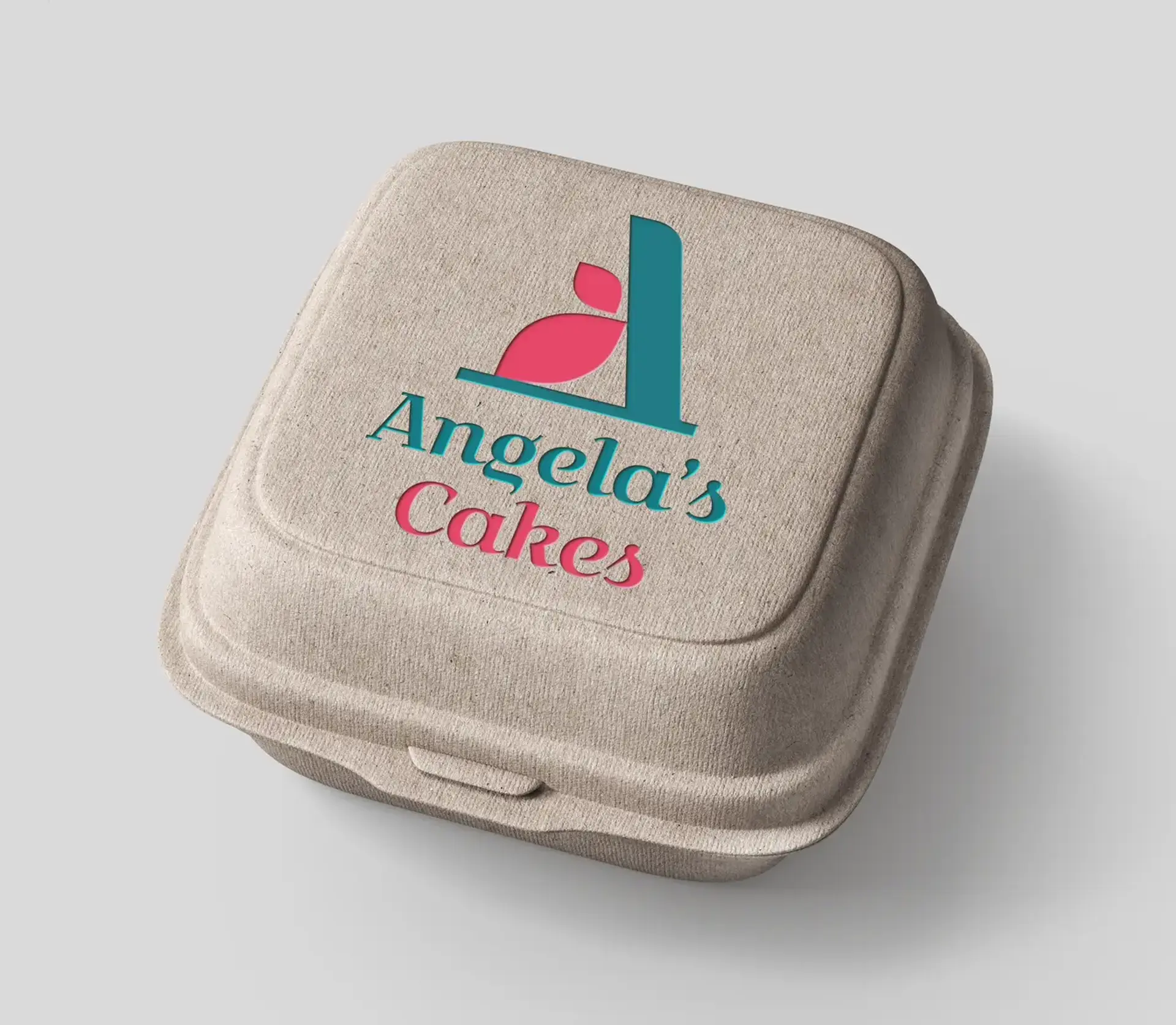
Copy developed for each project
The written content isn't an afterthought. Each project description is developed to communicate intent — what problem it solved, what constraints shaped it, what the result means. Good copy does two things: it helps visitors understand the work, and it helps search engines index it.
Every feature listed here serves the same goal: make it as easy as possible for the right person to understand what Duncan does and decide to work with him. The site gets out of the way and lets the architecture speak.